Bentley UX design systems
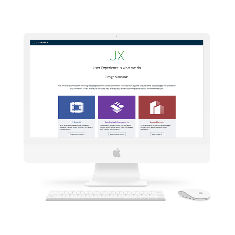
Near the end of 2018 the User Experience team at Bentley Systems set out to create a series of design system documentation websites and related websites. I was promoted to Visual UX Manager and over time formed a new team of five colleagues that focused solely on standards. Not only was my team responsible for creating UI / UX standards for all developers within the company, but we also had to build the website used to serve up the standards.

The problem
- For developers – Specifications and usage guidelines on UI components were scattered through out the company’s intraweb or completely inaccessible and required knowing the right person to ask.
- For project managers – It was hard to see the bigger picture. It was unclear how all the UI components would work together. Bentley Systems needed a defined UI & UX pattern for consistency across all applications.
- For UX team members – The available internal tools were not a good fit for sharing our research and documentation. Over many years the UX team designed and built 3 unique Design Systems all hosted on different services. Some were hard for non-developers to maintain, some had ugly URLs that could not be memorized or changed, and because all of the sites were on different services it was hard to compare the 3.
This was a complicated task in many ways. We needed to find a solution that was easy enough for non-coders to use, but that had enough features to allow us to accomplish our goals. We also needed the UX team’s buy-in on the new platform; if the team didn’t like using the service, they would dread maintaining it, and it would fail over time. We were in search of a final, permanent solution. Spoiler alert: we ended up building our own! 🤫
The plan
I was excited to take on this challenge and lead the team responsible for finding a solution for this problem that had frustrated the team since I first joined nearly 7 years ago. After discussing the task in more depth we came up with the following plan:
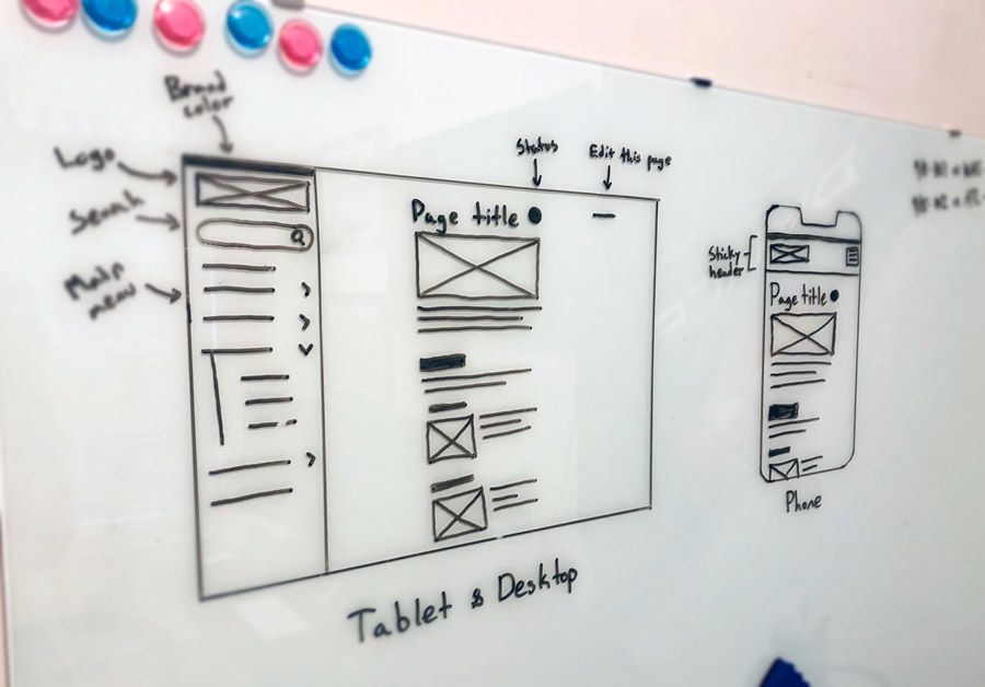
- Unify the platform sites - Each platform website was built by a different team lead, on differing services, at different time periods, so there was no consistency. We wanted to build a layout for our UX sites that persisted across all platform sites.
- Brand each platform uniquely - Because we planned to unify the layout of all of the platform sites, each platform needed unique branding so there would be no confusion as to which platform you are working with.
- Make it easy to use - The UX team consisted of 18 people that ranged from novice to expert in coding ability. It was important for team member to be able to maintain the site easily.
- Make it adaptable - While we wanted the site to be easily accessible to novice coders, we didn’t want to restrict expert users.
- Work within our restrictions - The company was unwilling to grant certain privileges such as access outside of the intranet or database access.
The solution
After researching options it became clear that we needed a custom solution, but the company was unable to devote developer time to building an internal-only tool. We were determined to find a final solution that would please all parties involved and that’s exactly what we did. Here’s what we came up with.
Static site generator
Due to IT’s restrictions and the need for high levels of customizability yet ease of use, I felt that a static site generator would fit the bill. We decided to build our sites using Jekyll: a flexible static site generator that is built upon Ruby. Content is authored in kramdown, and complex statements are built using Liquid.
Repository & build process
Bentley Systems is heavily invested in Microsoft services, so we decided to use Azure DevOps to assign tasks, link those tasks to files within the repository, and then automate builds and deployments using DevOps pipelines. Getting the DevOps pipelines to completion was a collaboration between the UX team, developers, and the IT department, as this was very much outside of the UX team’s skillset.
Unify the sites
The visual appearance of all the UX sites were designed to look similar. The 3 platform sites had identical layouts and content structure. The UX Home, Icons, and Workflows sites had slightly different usecases than the platform sites so the layout of those sites were adjusted to best suit the user needs.

Because all of the sites had matching layouts now, the uniqueness of each platform was somewhat lost. To solve this problem we relied on strong branding to give each platform a unique identity.

The workflow
Once the site was deployed we knew we’d have many UX team members contributing content to the site. We needed to define a workflow for our content authors not only so the site structure remains clean & efficient, but so there is general team consensus on new standards being approved. We came up with a process and gave it the acronym PACE:
- Propose - When a problem is detected, we need to escalate it to the attention of the rest of the UX team. This is where you have the opportunity to introduce your suggested solution and expand from there.
- Audit - Bentley Systems is a large global company with many teams working on different applications. The desire to unify starts with us checking to see how other teams may have already solved a problem before introducing a new, different solution.
- Create - A standard must have a bevvy of things before it is considered ready for approval. A basic description, usage guidelines, specifications, embedded Yammer discussions, and a working demo are just a few of the requirements.
- Educate - Approving a standard wasn’t enough, we then needed to spread the word and educate the rest of the company of it’s existence. The UX team already had a weekly educational webcast called UX Tuesdays. We decided to piggyback off of that and would make short 2 minute announcements at the start of every week’s meeting to broadcast that week’s newly approved standards.
The outcome
On we flipped the switch and UX.Bentley.com was announced throughout the company. Out of sheer excitement for the announcement I created a short Apple-esque marketing video that was intended to get people excited about the release but also to help associate each platform with its unique logo and branding color.
Analytics
Since launch we used Google Analytics to track the site’s usage. Within a month of launch, we had increased active users by 16.67% and visits by 37.46%. Not only did this prove that the sites were being used, it also confirmed that our plans to spread the word and to keep everyone in the loop were working.
We noticed an increase in discussion not only between us and developers but between development teams. There have also been fewer misdirected emails as the websites make it very easy to discover who is the subject matter expert on any subject and how to get in touch with them. The websites are often used by the UX team for decision making and backing. Being able to link a developer to an official looking website increased the wider teams confidence in the standards that the UX team has developed.
Content
We initially only launched 2 sites: the UX home page & Bentley Web Components, also known as BWC. As of , we housed eight unique sites under the UX subdomain. Below is a hierarchical overview of the sites on the UX subdomain.
- UX Home
- 9 Zone UI
- Bentley Web Components
- Angular
- React
- Icons
- PowerPlatform
- Workflows
Since their inception, the UX sites have had a lot of content created and shared. As of this writing, the sites have grown immensely and continue to grow at a steady pace.
- 9 Zone UI hosts 46 standards.
- Bentley Web Components hosts 53 standards.
- Icons hosts 4,819 icons.
- PowerPlatform hosts 25 standards.
- Workflows hosts 104 personas, scenarios, & workflows.
Testimonials

I love it!

The UX sites are fantastic, a must have resource.
